← All projects

Design Systems & Accessibility / Independent concept

Common UI

A shared language for consistent digital products
Common UI design presentation

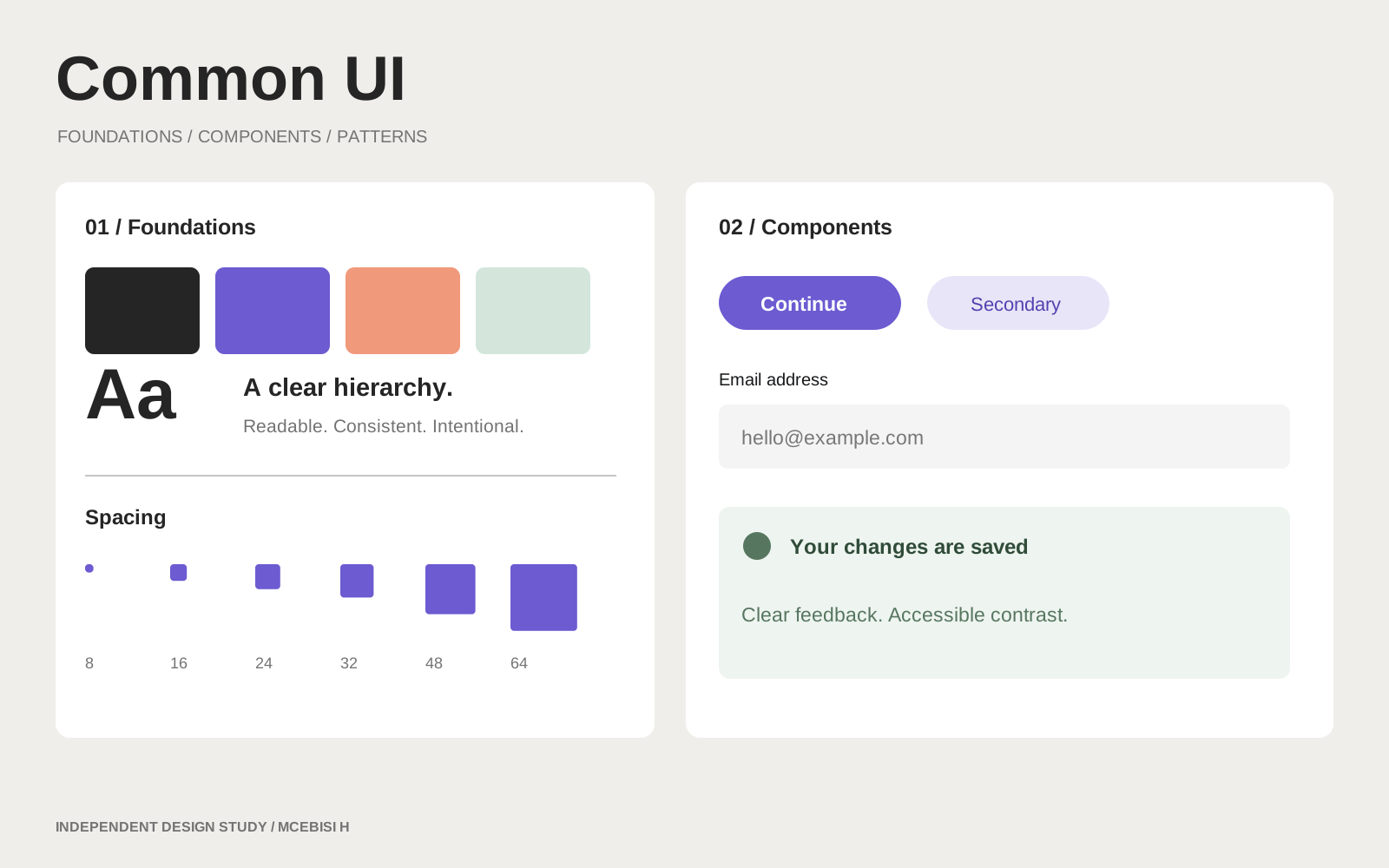
A design-system concept demonstrating colour tokens, type scales, reusable inputs, button states and interface composition.

Brief
A shared language for consistent digital products
Design approach
A design-system concept demonstrating colour tokens, type scales, reusable inputs, button states and interface composition.
Skills demonstrated
Design Tokens · Component Libraries · Accessibility · Documentation
Sample scope
Self-initiated portfolio concept with an original visual sample. The brand is fictional; this is not commissioned client work or evidence of measured business results.

Inside the design process

Build a small, explicit set of tokens and interaction states before assembling screens. Shared components make the interface easier to extend consistently.

Direction 1

Page-specific styling: fast initially, but prone to inconsistency.

Direction 2

Token-led components: selected for repeatability and clear state feedback.

From brief to interface

  1. 01Define type, spacing, surface and semantic colour foundations.
  2. 02Explore default, focus, invalid, loading and disabled states.
  3. 03Assemble the same components in a reusable settings form.
  4. 04Document keyboard behaviour and reduced-motion expectations alongside appearance.

Mobile composition

Foundations
Components
States
Composition

Desktop composition

Foundations
Components
States
Composition

Layout explorations: content hierarchy remains consistent as the grid changes.

Try the concept

Components with real states

Illustrative demo. No payments, accounts or orders are created.

Have a similar challenge?

Let’s shape a clear identity and a useful digital experience for your project.

Start a conversation ↗Explore services

More selected work